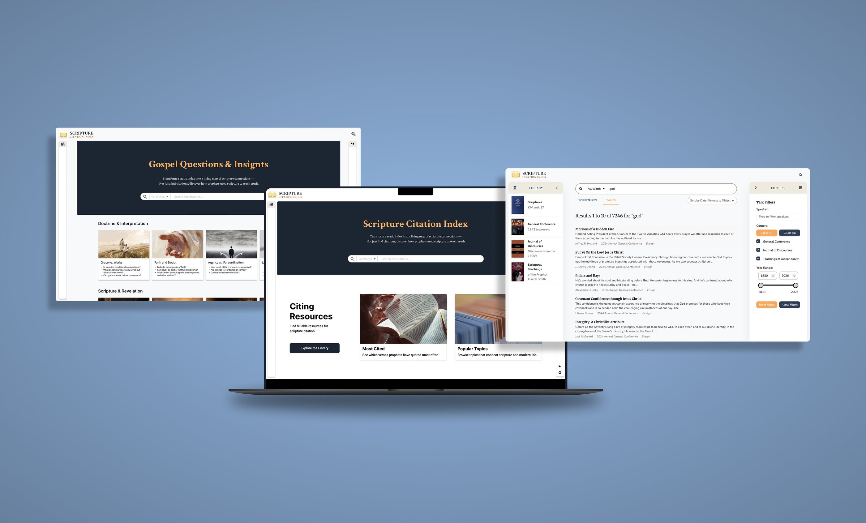
Scripture Citation Index (SCI)
Scripture study is meant to be reflective and meaningful — not spent fighting search tools and fragmented interfaces. Over time, the original Scripture Citation Index became a barrier rather than a bridge to deeper understanding.
TOOLS
Figma, Google Forms, Zoom, React, JavaScript, Graph QL
MY ROLE
UX + UI Design, Visual Design, User flow, Research, Prototyping + Testing, Front-End developer
TIMELINE
3 Months
Project Overview
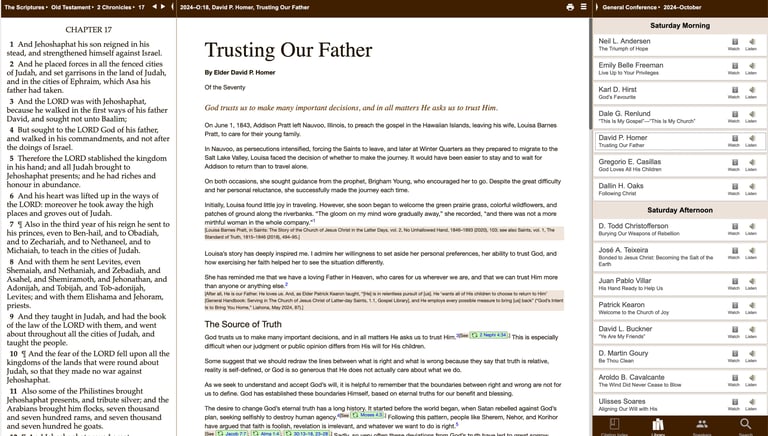
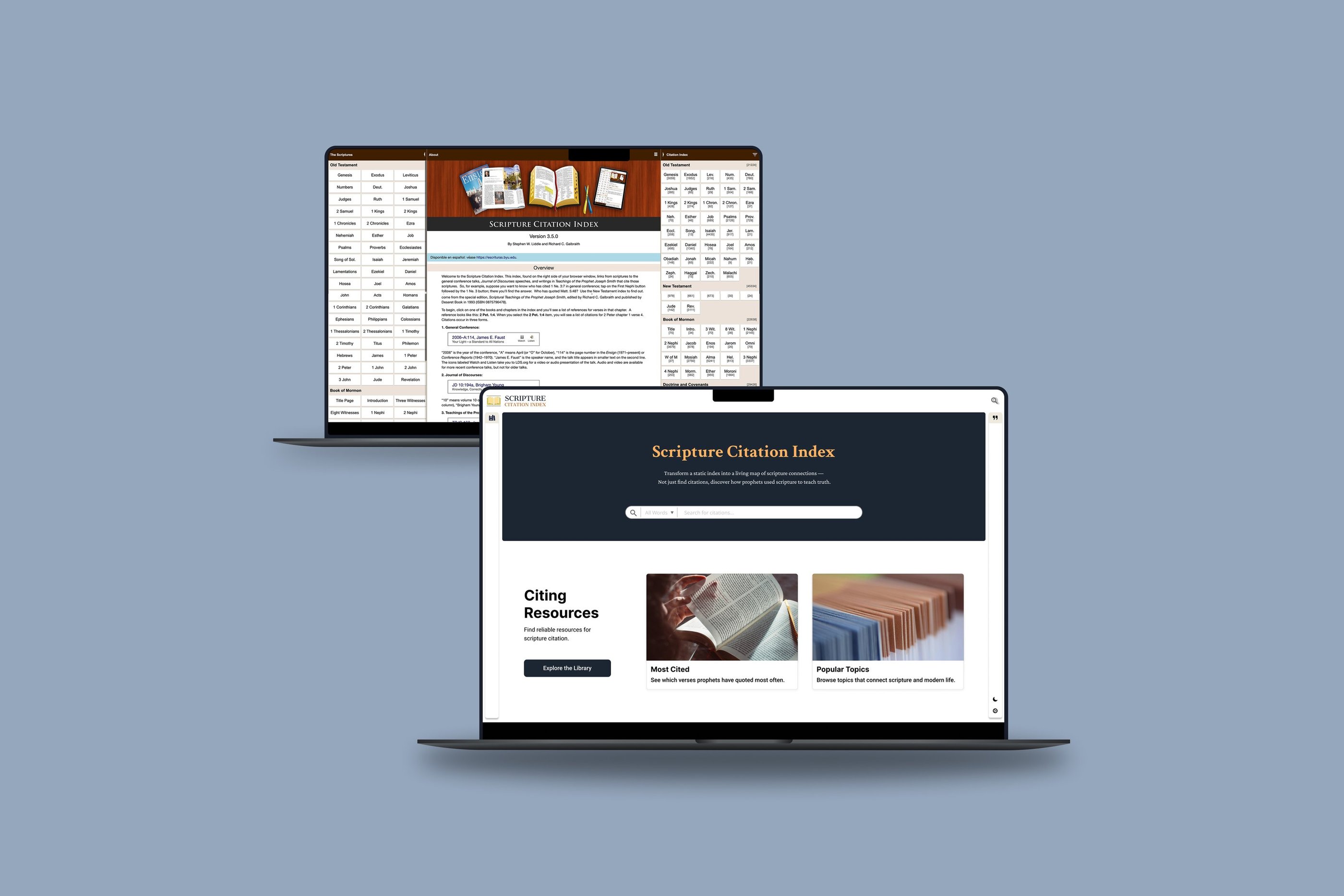
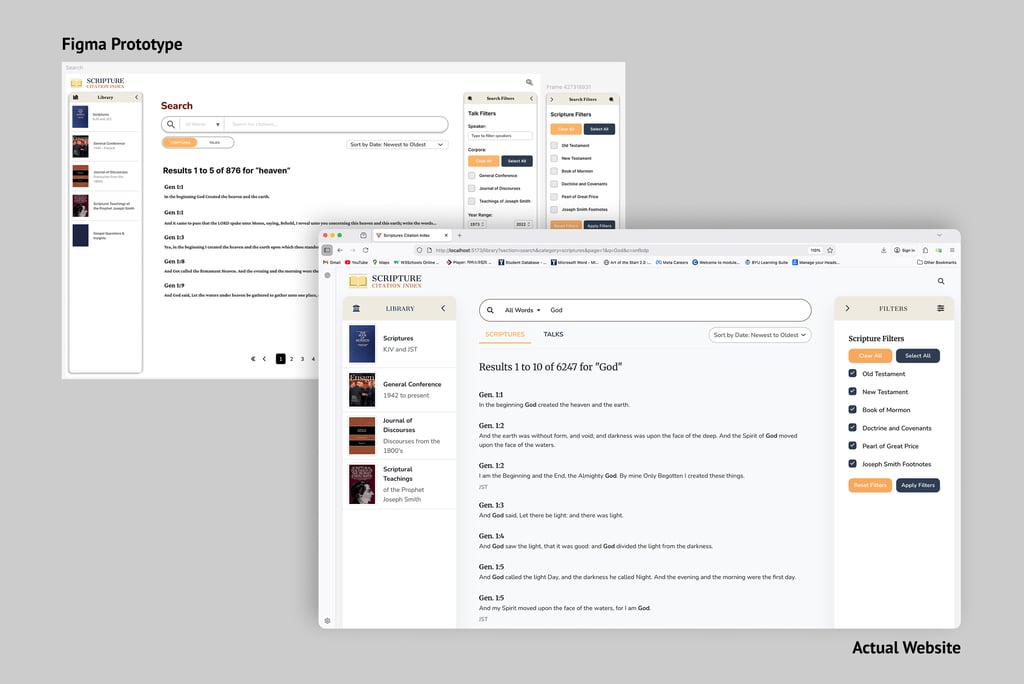
Scripture Citation Index is a research tool that helps users quickly find where scriptures are referenced across historical talks and religious writings.
This project focused on redesigning an existing, outdated app to improve search efficiency, usability, and engagement for active study.
THE CHALLENGE
Finding scripture references is slow and inefficient.
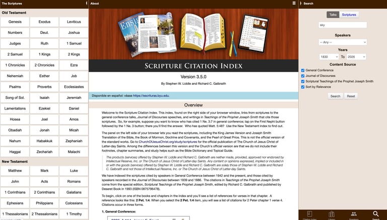
The existing SCI app contained valuable data but was difficult to use.
Users struggled to quickly find relevant citations due to dense layouts, weak visual hierarchy, and inefficient search workflows—making study time longer and less engaging than it needed to be.
OBJECTIVE/GOAL
Redesign the experience to help users find accurate results faster while making the interface clear, engaging, and easy to scan, so time is spent understanding content—not searching for it.
Design Process
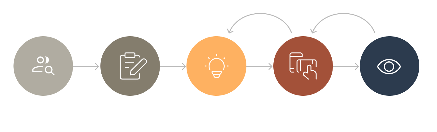
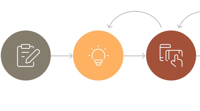
Research
EMPATHIZE
USER INTERVIEWS
Conducted in-depth interviews with 5 individuals to identify scripture study workflows and pain points in the previous app experience.
KEY QUESTIONS
Where do users lose time when searching for scripture references in the existing app?
How do users currently compare references across talks and teachings?
Which parts of the interface reduce clarity and usability?
FOUND
Fragmented Search Experience
No Clear Way to Compare Teachings
Low Engagement Due to Outdated Interface
Users had to navigate across multiple screens and sections to locate a single reference.
Search results were scattered, causing users to spend more time navigating than studying.
The app did not support side-by-side or structured comparison of how different leaders referenced the same scripture or topic. As a result, users manually pieced together information, frequently losing context.
The text-heavy layout lacked visual hierarchy, making it difficult to quickly scan results.
Users described the app as functional but not enjoyable or intuitive, which reduced engagement over time.
User Personas
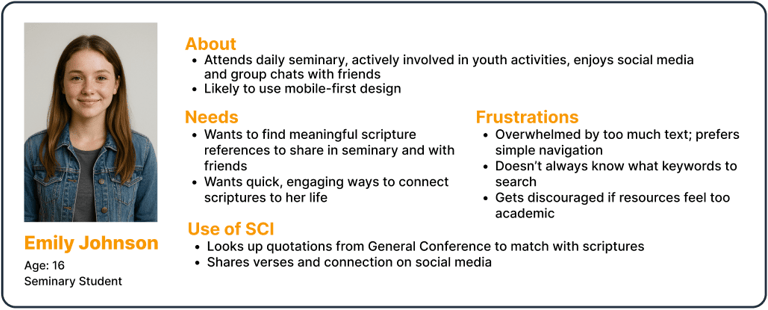
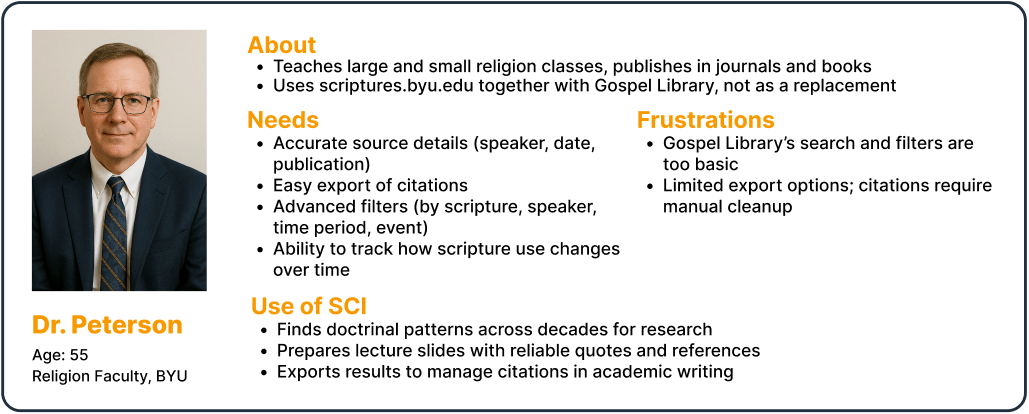
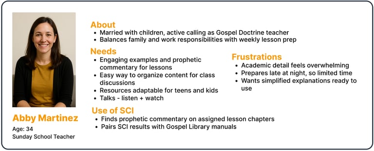
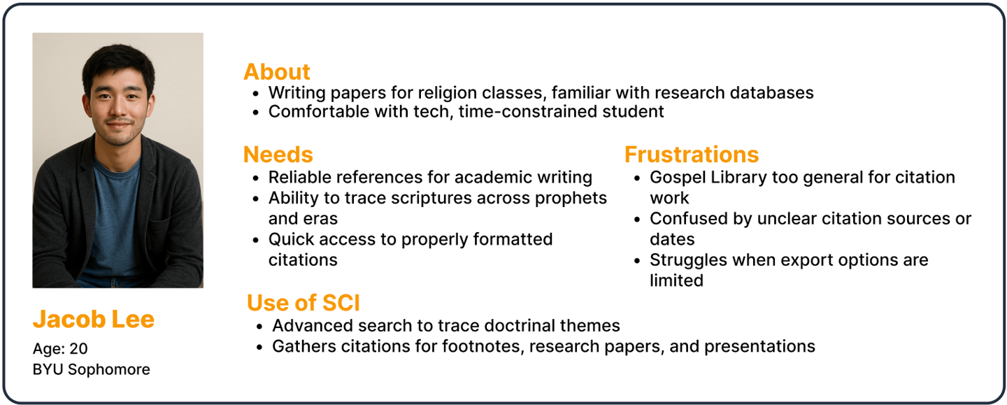
Based on insights from user interviews, I developed personas to represent the core user groups of the Scripture Citation Index. These personas helped align the redesign around real study workflows, ensuring the experience supported both quick lookup and deeper comparative study.
Points of View
How Might We
Project Goals
Students studying scripture need a way to quickly locate where verses are cited, without losing focus navigating multiple fragmented sources.
Researchers and instructors need reliable tools to compare how the same scripture is referenced across talks and time periods to support deeper analysis and teaching preparation.
Faith-driven learners need an interface that supports focused, engaging study rather than slowing them down with dense layouts and inefficient search flows.
How might we help users find relevant scripture citations faster while maintaining accuracy and context?
How might we design a search-driven experience that supports both quick lookup and deeper comparative study?
How might we modernize the interface to make scripture study more engaging without distracting from the content itself?
Before moving into design solutions, I aligned user needs, product constraints, and technical feasibility to guide the redesign.


Reduce the time required to find relevant scripture citations.
Improve search clarity through filters, scalable results, and visual hierarchy.
Create a modern, focused interface that supports long study sessions.
Ensure the system remains accurate, reliable, and scalable across a large dataset.
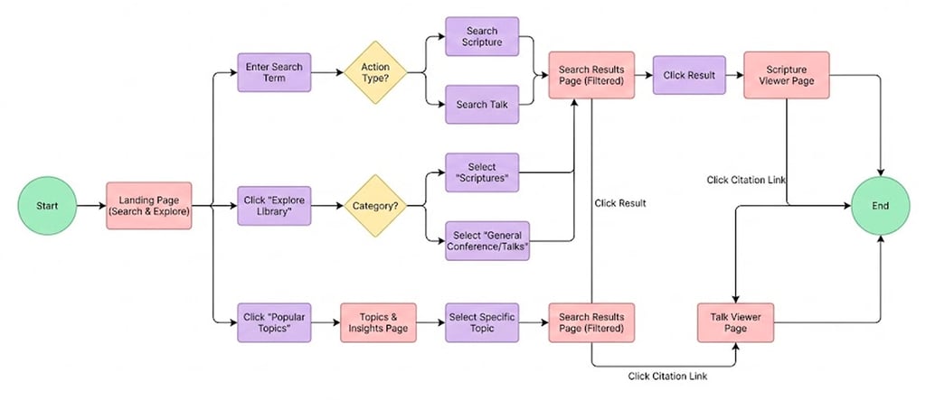
User Flow
Quickly find where a scripture is cited and understand its context across talks and teachings.
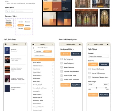
Low - Mid Fidelity Wireframes
I started with low- to mid-fidelity wireframes to test layout and navigation changes based on insights from user interviews. The goal was to simplify the search flow, reduce cognitive load, and help users find relevant citations faster.
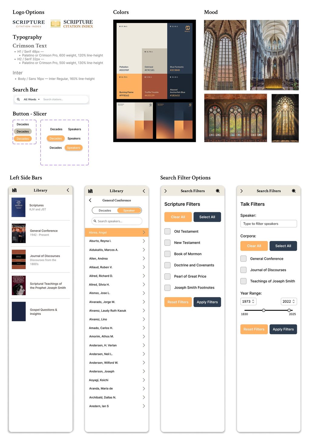
Branding
The visual identity was designed to convey a sense of calm, reverence, and intellectual focus.
The branding supports deep study by reducing visual noise and emphasizing clarity, trust, and reflection.
Every design choice was made to respect the sacred nature of the content while remaining usable, modern, and research-driven.
Design Language
Reverent Minimalism
A restrained, minimal design language that balances sacred tradition with modern usability — allowing scripture, insight, and comparison to remain the primary focus.
Core Emotions: Calm · Inspired · Trustworthy
Design Principle: Sacred simplicity — where scripture and insight meet
Color Palette
The color palette draws inspiration from sacred architecture and quiet study environments.
Muted neutrals, deep blues, and warm accent tones create a sense of reverence and stability while maintaining sufficient contrast for readability and accessibility.
Typography
Typography was selected to balance tradition and clarity.
Serif styles are used selectively to echo historical and scholarly texts, while clean sans-serif typography supports readability in search results, filters, and data-dense views.
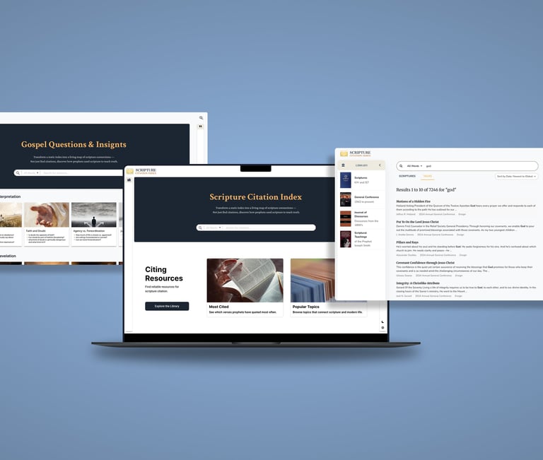
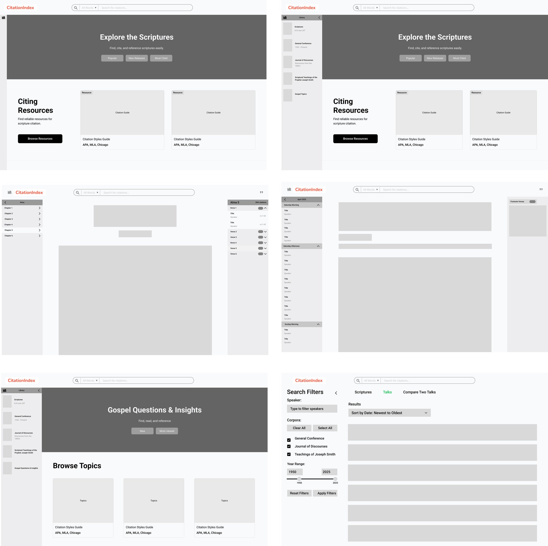
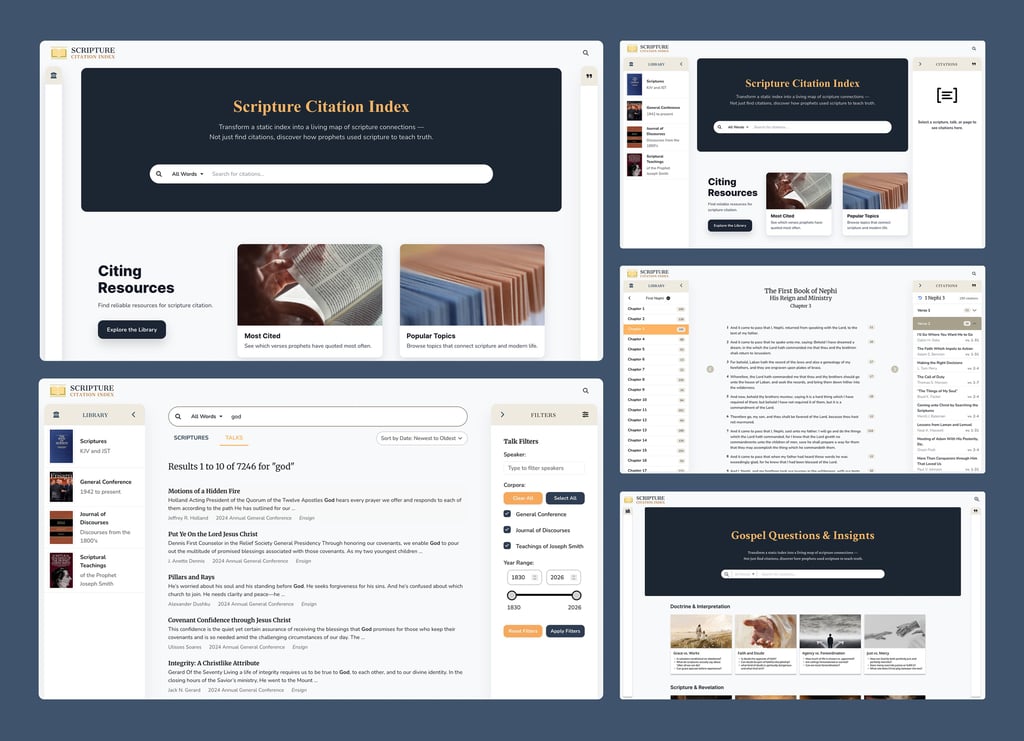
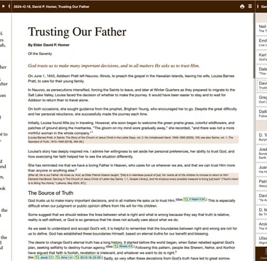
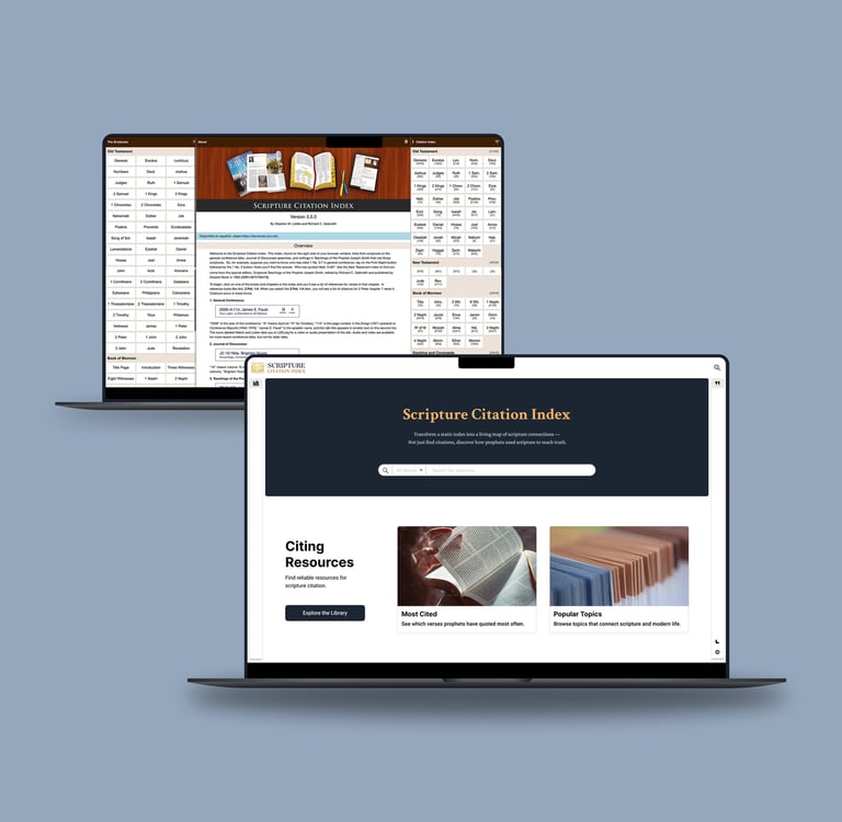
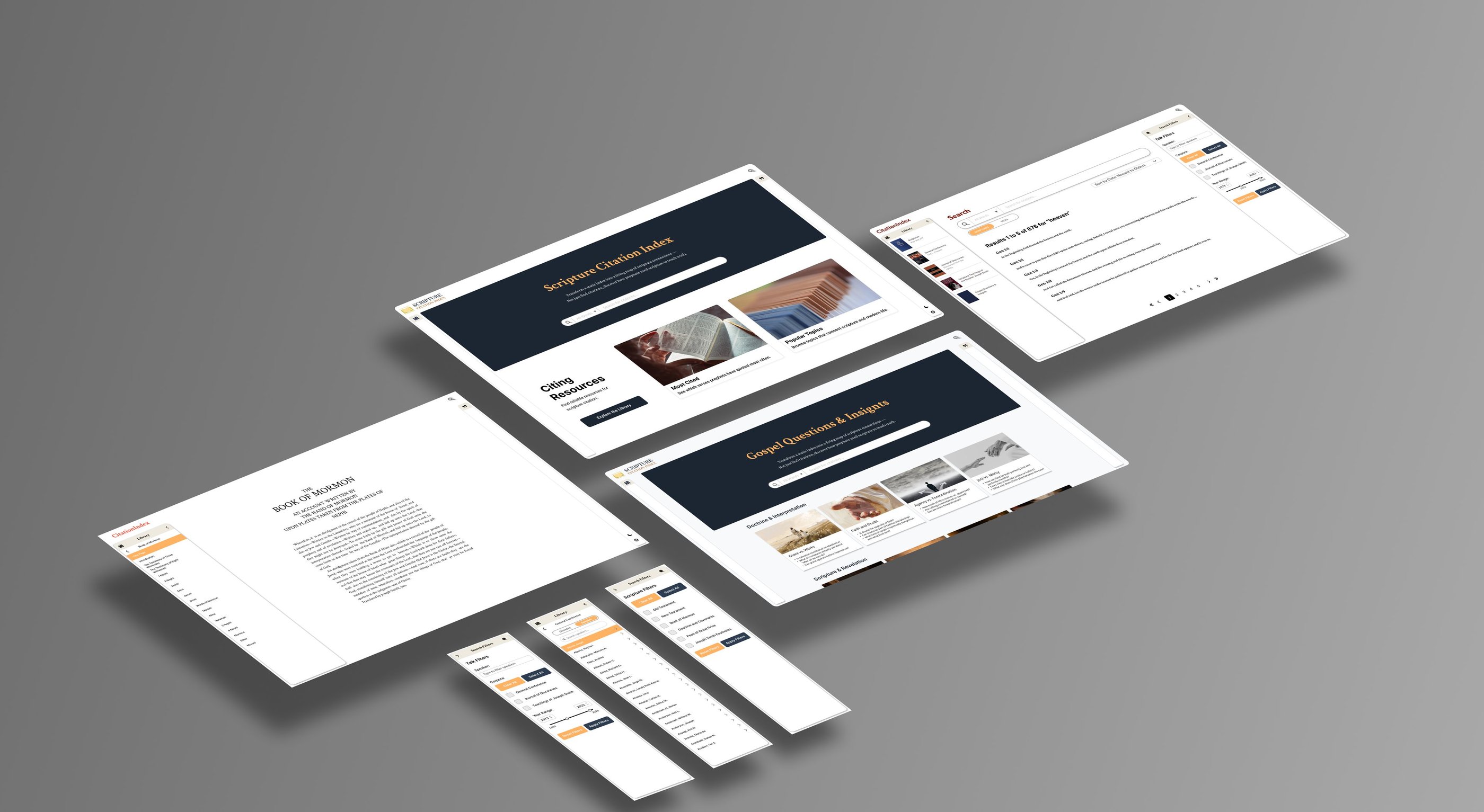
High Fidelity Prototype
The high-fidelity prototype translates research insights and design principles into a polished, production-ready interface.
It focuses on search-first navigation, scannable results, and calm visual hierarchy to help users find and compare information quickly without losing context.
Each screen was designed to reduce cognitive load, reinforce trust, and support focused study through clear typography, intentional spacing, and subtle interactions.
Usability Testing
Usability testing was conducted with 5 participants to evaluate whether the redesigned experience improved search efficiency, clarity, and overall engagement compared to the previous version of the app.
Participants were asked to complete two core study-related scenarios that reflect real-world use of the Scripture Citation Index.
Test Scenarios
Scenario 1: You are studying a gospel topic. Use the search feature to find where a specific scripture is cited across multiple talks.
Scenario 2: You want to compare how different speakers reference the same scripture. Apply filters and navigate the results to review and compare relevant sources.
Metrics Tracked
Time on Task: Measured how long it took participants to locate accurate and relevant results for each scenario.
Task Success Rate: Assessed whether users could complete each task without assistance.
Error Rate: Observed moments of confusion, mis-clicks, or difficulty understanding results or filters.
Engagement Score: Participants rated how engaging and visually clear the experience felt on a scale of 0–100.
Ease of Use: Participants rated how easy each task was to complete on a scale of 1–5.
Success Criteria
Users should be able to find relevant scripture citations in under 15 seconds, compared to the previous average of 45 seconds.
Users should successfully complete both scenarios without guidance.
The average engagement score should improve compared to the previous experience.
The majority of users should rate ease of use as 4 or higher.
Results
100%
Task Completion
2 X
Faster Search Time
4.7/5.0
Engagement Score
This shift allowed users to spend more time engaging with scripture itself rather than navigating the interface — reinforcing the tool’s role as a study companion, not a research obstacle.
Before vs. After
User Feedback & Iteration
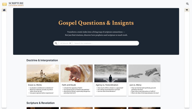
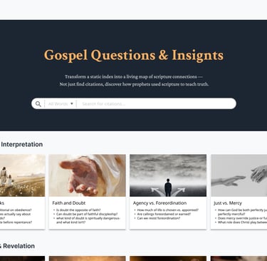
During usability testing, Several users noted that while keyword search was powerful, it would be helpful to browse scriptures and citations by topic when they were exploring questions rather than looking for a specific verse.
To address this feedback, I introduced a topic-based browsing experience that complements keyword search.
This new page organizes scripture citations around common gospel questions and themes, allowing users to explore content more intuitively and discover connections without needing precise search terms.
I often begin my study with a general idea rather than a precise term. Being able to explore by topic would make it easier to learn and see how different scriptures connect.”
When I’m studying, I don’t always have a specific verse in mind. I want a way to browse by topic or question and then narrow things down as I learn more.”
"
"
EMPATHIZE
DEFINE
IDEATE
PROTOTYPE
TEST
ITERATE
ITERATE
UX/UI Design
From Design to Build
Designing with implementation in mind
I implemented key front-end flows using React and JavaScript to ensure the tested experience matched the shipped experience.
By translating UX decisions directly into code, I preserved search clarity, performance, and interaction intent—without handoff loss or late-stage compromises.
Web Development
What I Built
Core search and filter interactions in React
Dynamic rendering for citation-heavy results
Reusable UI components aligned with the design system
Responsive layouts optimized for performance
Owning both design and front-end allowed the product to move faster, iterate with confidence, and ship with fewer assumptions. I design for real systems—not just screens.
Why This Matters
Future Impact
This project represents a meaningful step toward making deep, reflective scripture study more accessible, intuitive, and engaging. By reimagining the Scripture Citation Index as an exploratory learning tool rather than a static reference, the following opportunities outline how the platform could continue to grow and create long-term value.
Intelligent Topic Discovery and Semantic Search
As the platform evolves, semantic search and AI-assisted topic clustering could help users explore scripture citations by meaning rather than exact keywords. This supports users who begin with questions or themes, enabling richer discovery and deeper understanding of scriptural connections.
Personalized Study Paths
Future iterations could introduce personalized study paths based on users’ interests, past searches, or frequently explored themes. This would transform SCI from a simple lookup tool into a guided study companion, encouraging sustained engagement and intentional learning.
Expanded Educational Context
Adding lightweight explanatory layers—such as historical context, doctrinal summaries, or thematic overviews—could help users interpret citations with greater confidence. This would be especially valuable for students and first-time users navigating complex religious texts.
By removing unnecessary complexity, SCI reframes technology as a quiet partner in learning — one that steps back so reflection, understanding, and connection can take center stage.
SKY SONG
Contact
haneulisstudying@gmail.com
385) 307 6810